BACK
june 10, 2025
industry: Retail Tech
client: vendex ltd
website: ———.com
Vendex POS — Minimal POS Interface for Small Retail & Supermarkets
Vendex is a minimal POS interface designed for small retail stores and supermarkets. It focuses on speed, clarity, and ease of use, helping attendants complete transactions faster with fewer errors.
Overview
Type: Personal Project
Tools: Figma, Notion
Focus: UI design, usability, visual clarity
Goal: Create a clean, intuitive POS that reduces errors and speeds up checkout.

Problem
Most small shops use cluttered, outdated POS systems.
This leads to:
Slow training
Frequent input mistakes
Longer checkout flow
I set out to design a faster, cleaner, low-friction alternative.
Approach
Skipped heavy UX deliverables focused on observing real attendants, identifying pain points, and translating insights directly into clear layouts.
Principles:
Keep it minimal
Reduce thinking
Prioritize speed
Design Direction
A neutral, calm visual system with readable typography and structured spacing.
Typography: Modern sans-serif
Colors: Soft neutrals + warm accents
Layout: High-contrast sections, clear hierarchy
Buttons: Large targets with obvious states


Key Features & Impact
This design project focused on refining the point-of-sale (POS) interface to deliver a fast, efficient retail experience.
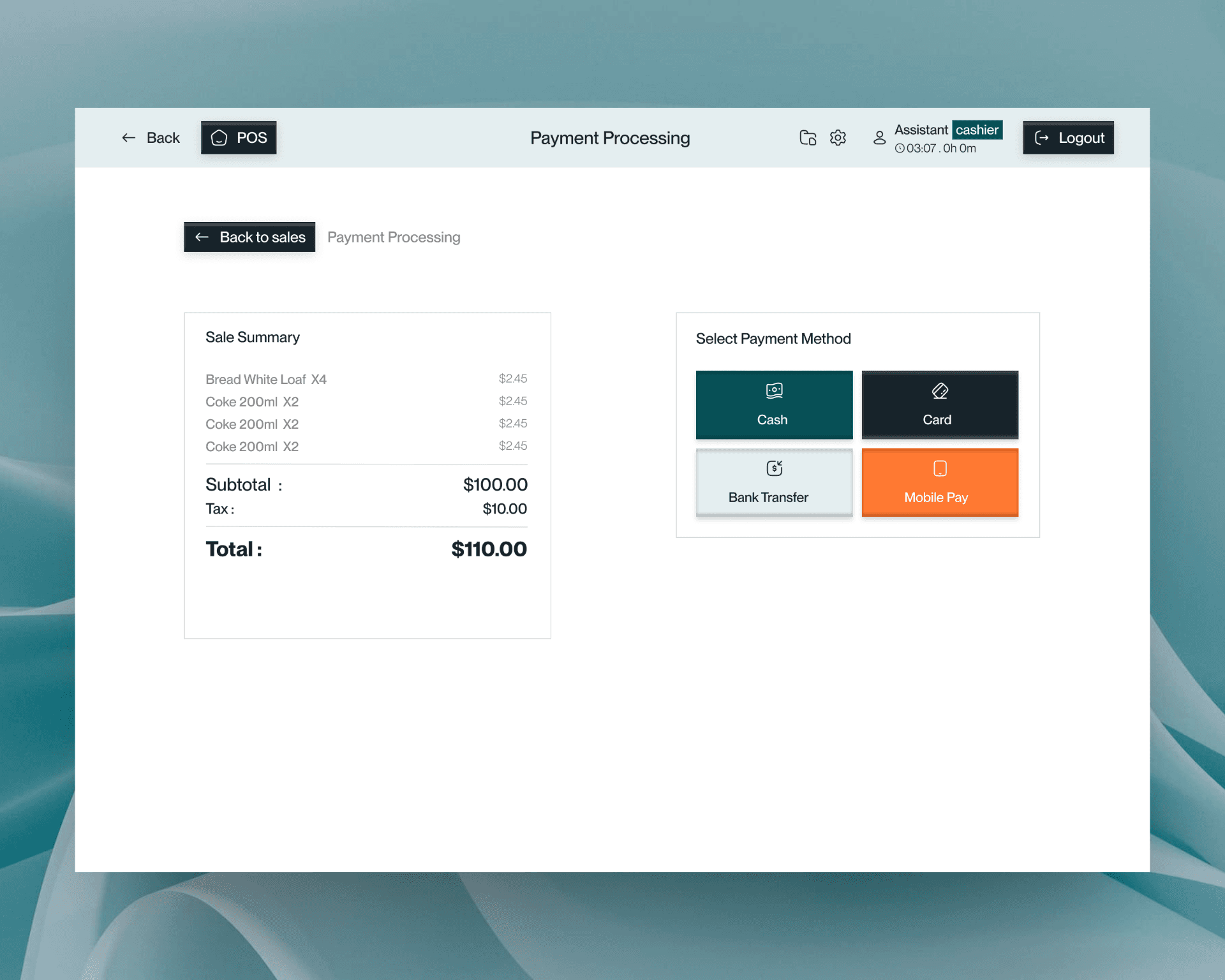
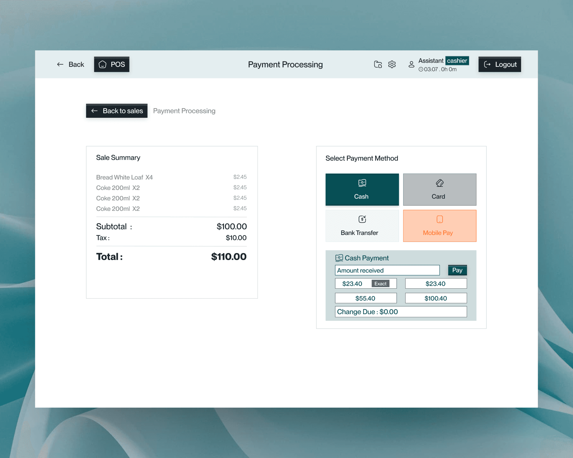
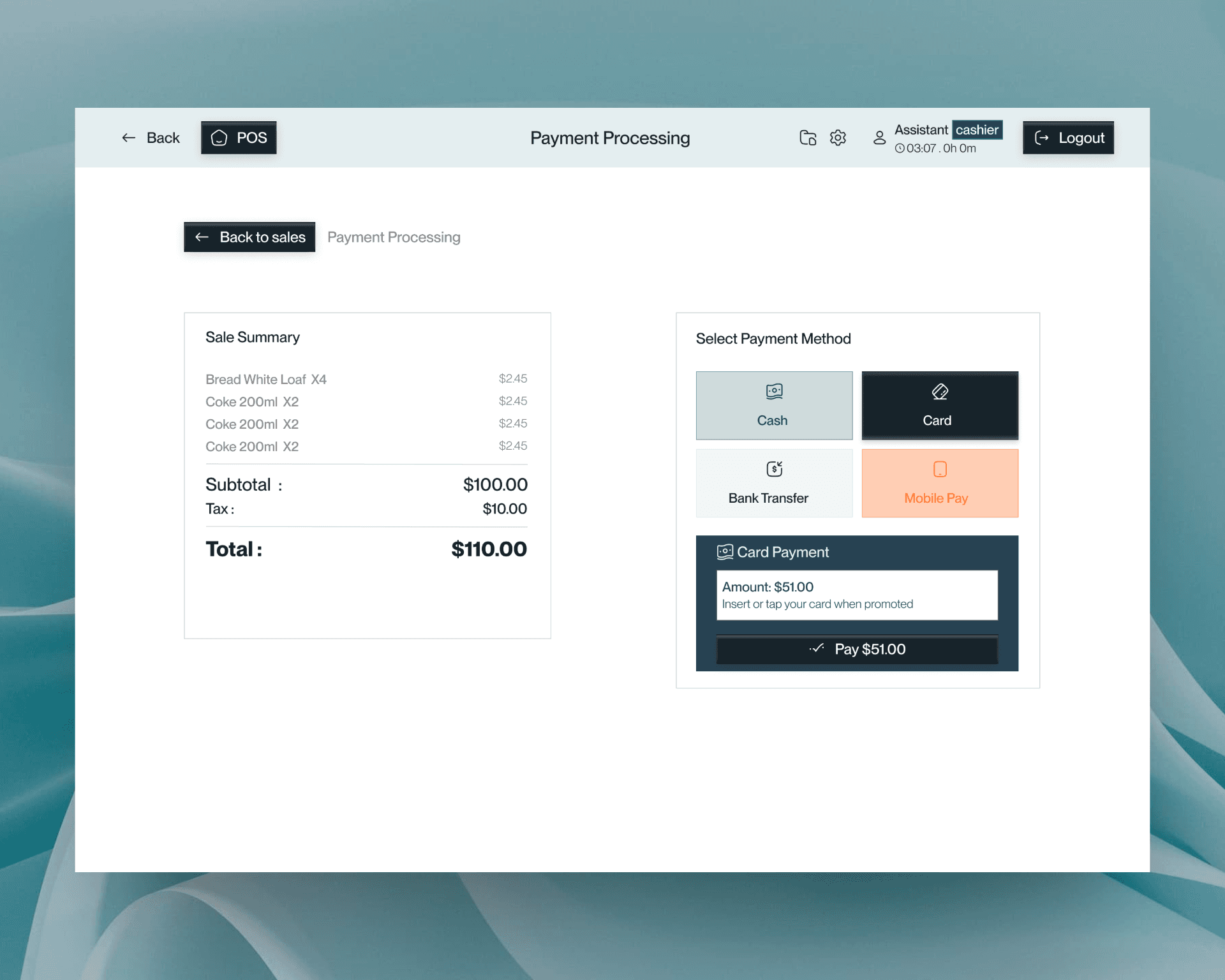
Key Screens: UI elements are optimized for speed and accuracy:
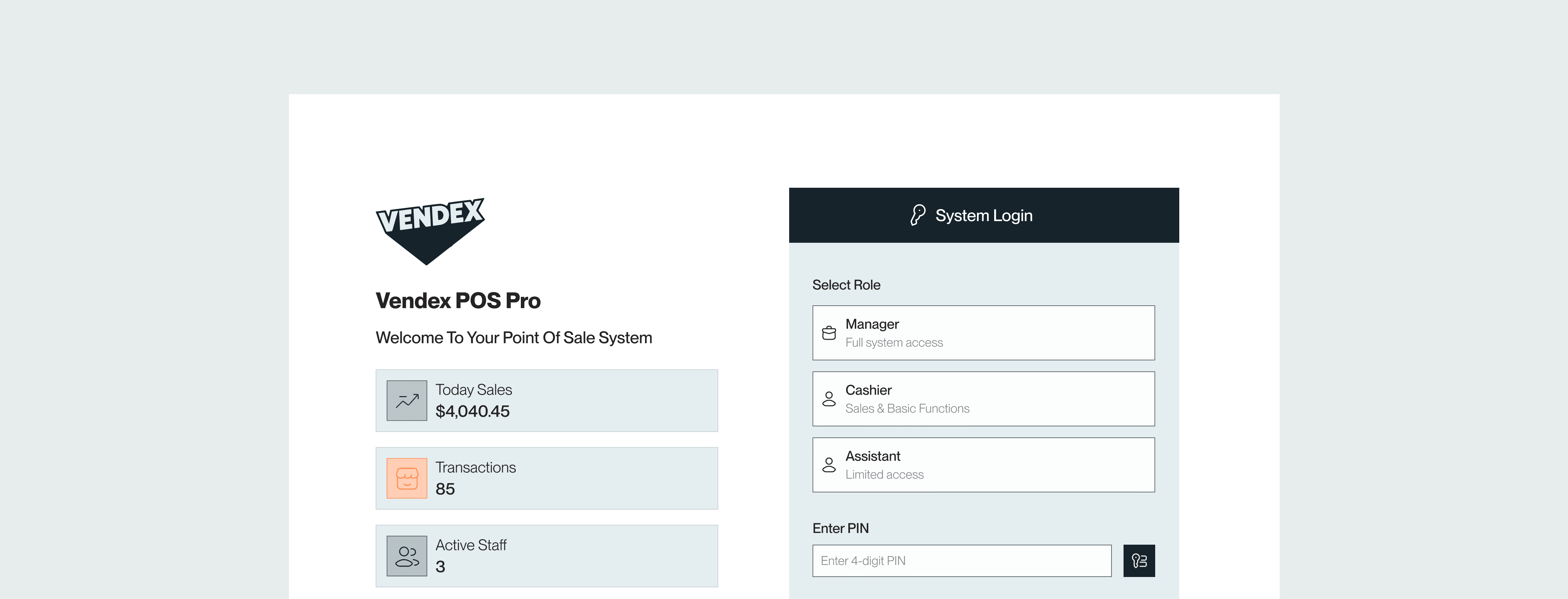
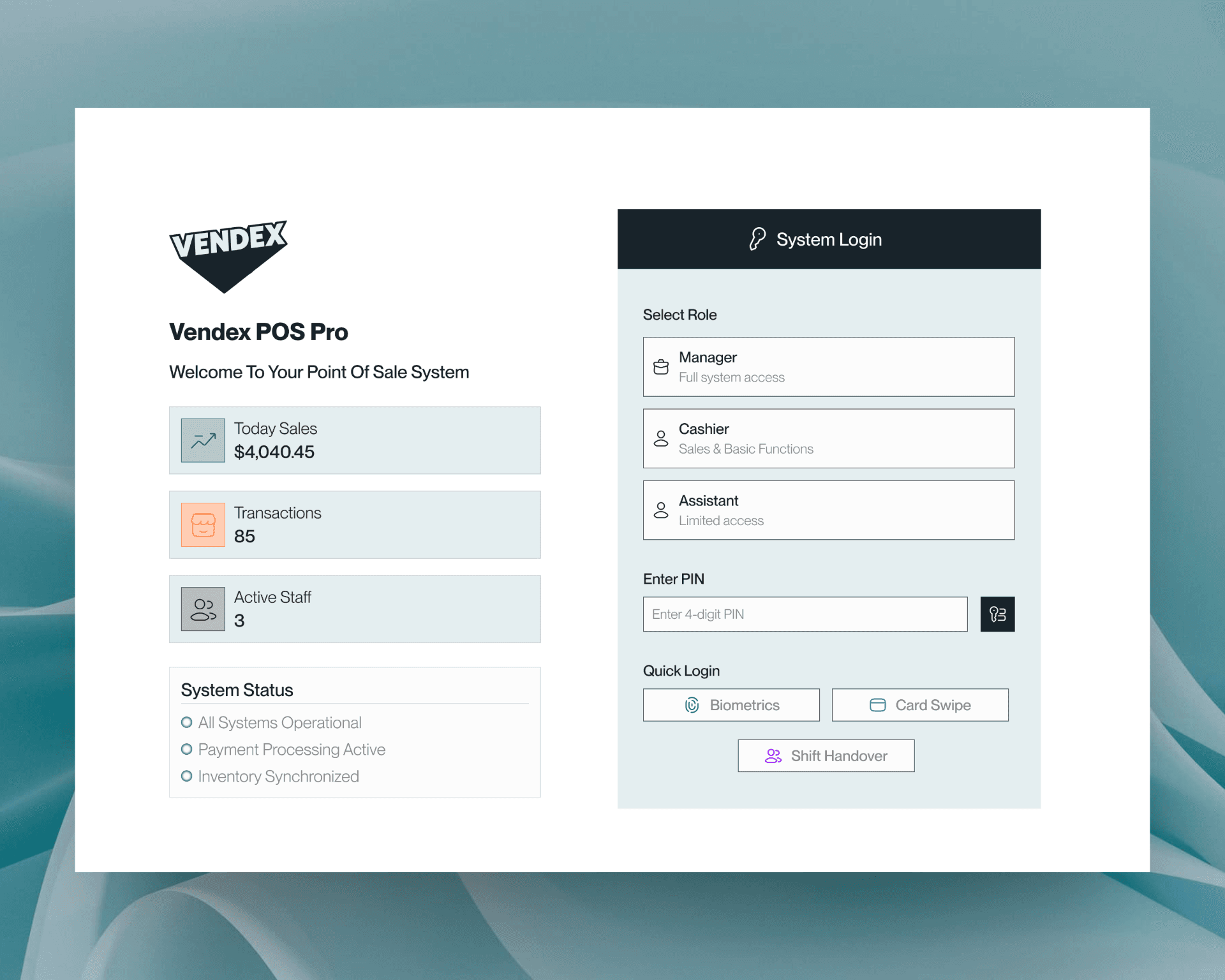
Login features a strong, distraction-free CTA.
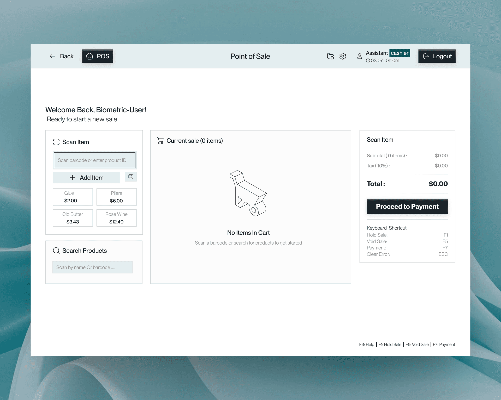
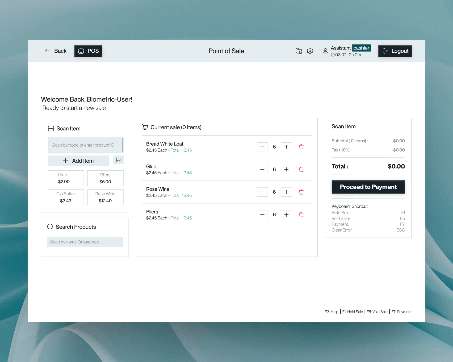
Main POS View uses legible tables for quick actions.
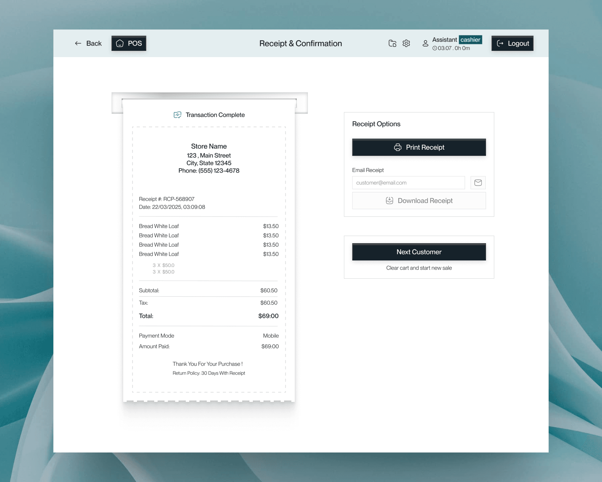
Cart & Summary employs focused grouping to prevent misreads.
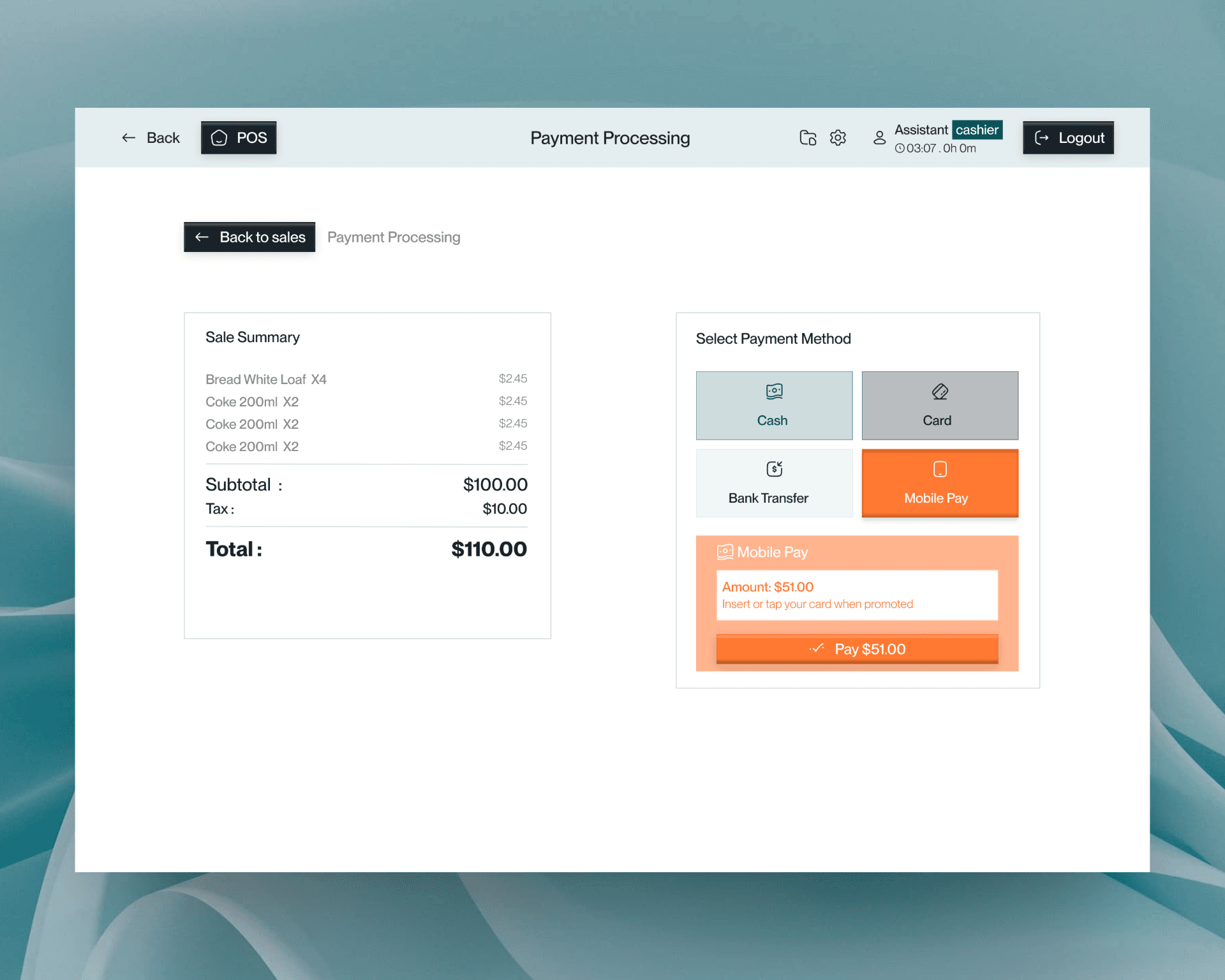
Payment uses high-contrast buttons for fast choices.
Reports utilize uniform tables, resulting in zero new learning curve.
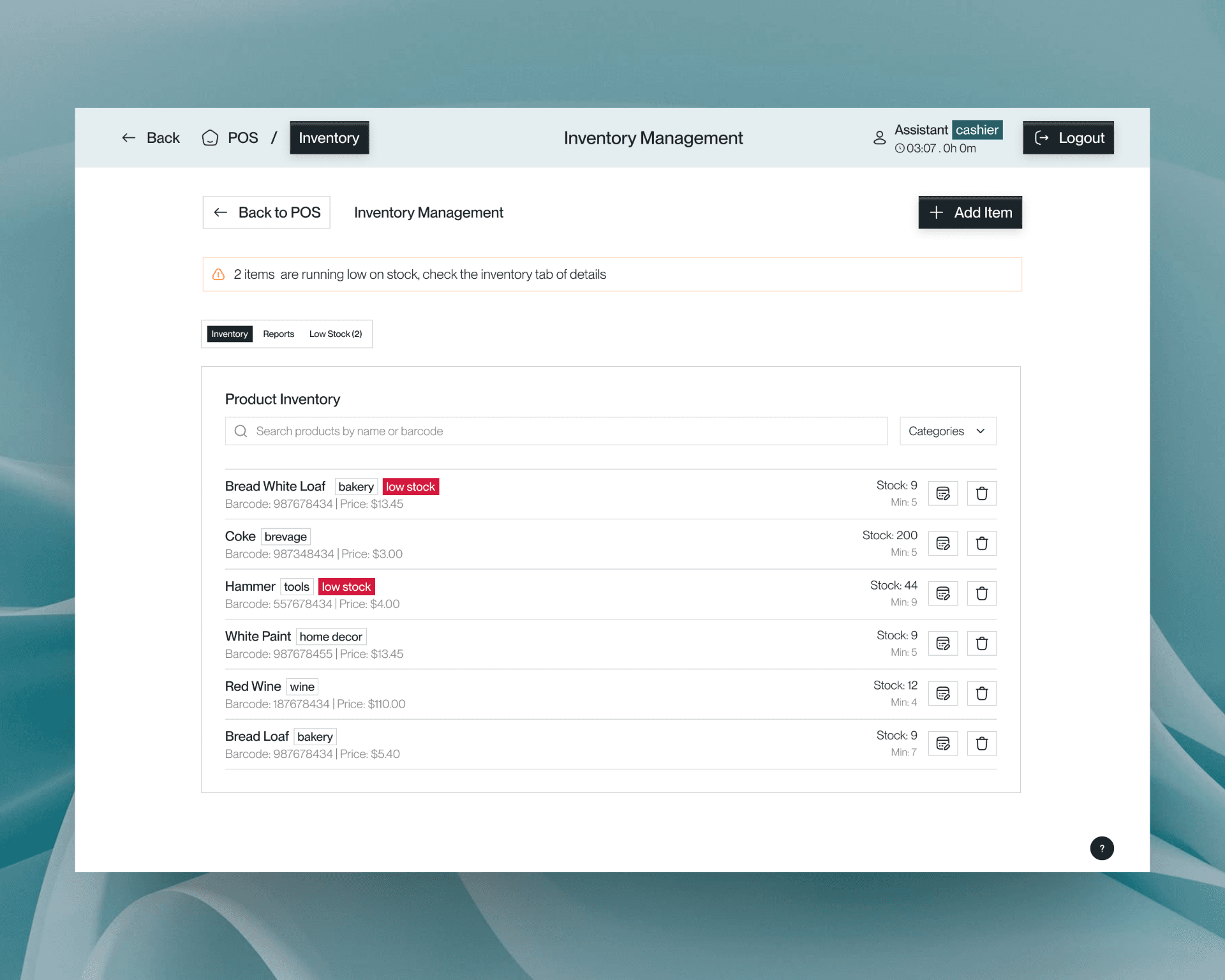
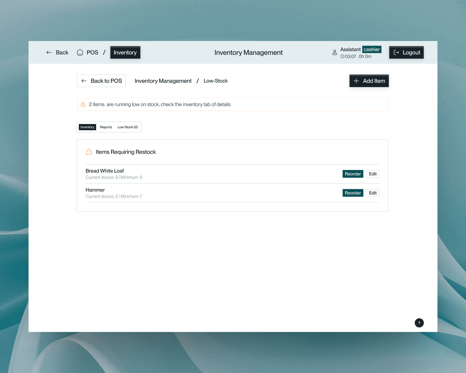
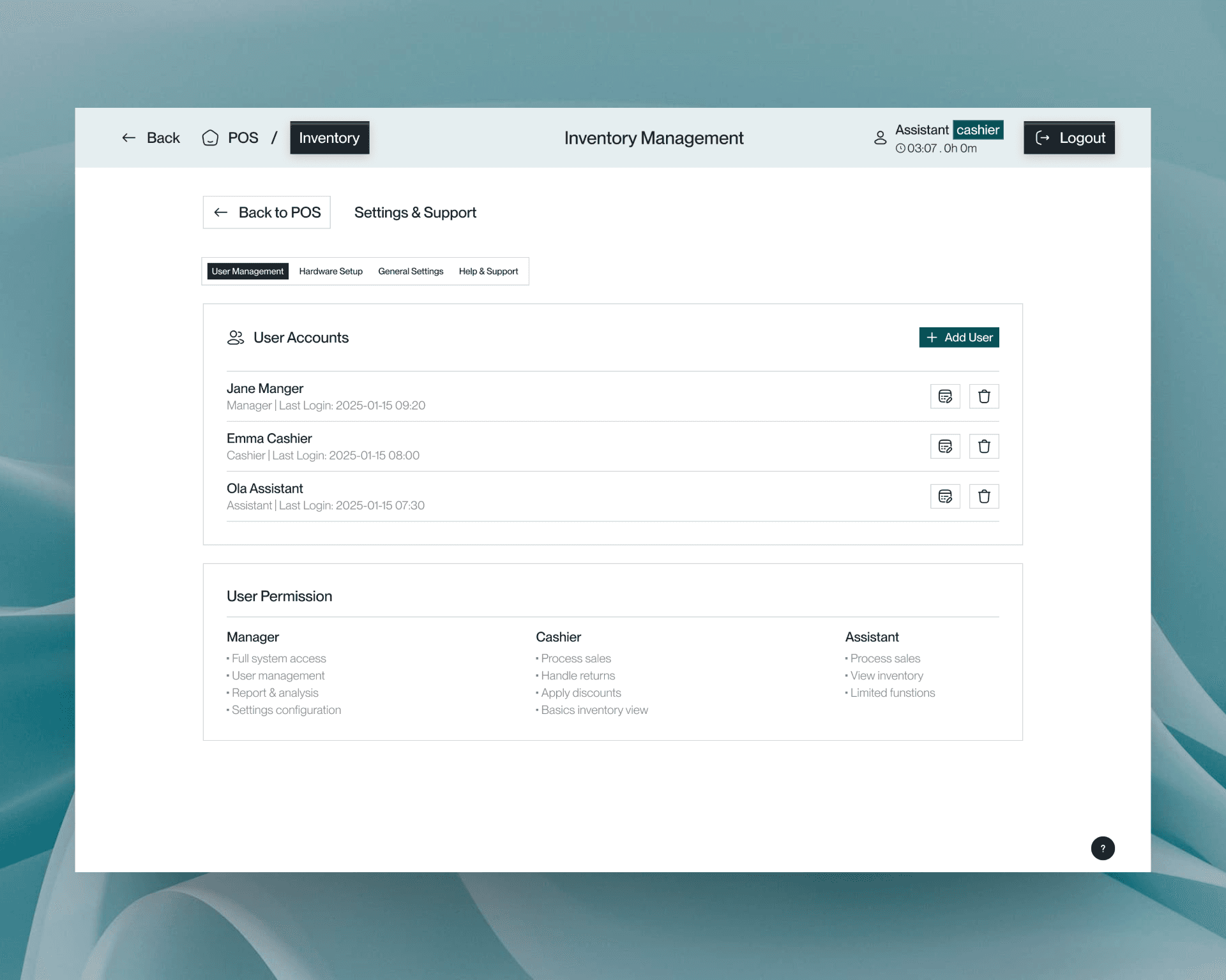
Inventory
Outcome: The clean, modern design leads to a significantly lower cognitive load, enabling faster training and resulting in fewer misclicks and errors.
Reflection: The philosophy was simple: Good UI disappears. The goal was to make everyday retail tasks smoother, faster, and more human, rather than reinventing the system.